
Designing scalable UX systems
Standardizing UX Content and Team Processes: Building a System, Not Just Screens
How we turned best practices into shared infrastructure
In fast-paced product teams, content decisions are often made in isolation by designers, guessing at button labels, writers rewriting the same error messages, and teams reinventing familiar patterns. It leads to duplication, and a fragmented user experience.
This is the story of how we standardized both our UX content practices and cross-functional collaboration by systematizing the best of what we were already doing.
This is the story of how we standardized both our UX content practices and cross-functional collaboration by systematizing the best of what we were already doing.
The сhallenge: everyone was doing their best differently
We had talented designers and UX writers who deeply cared about clarity and consistency. But without a shared framework:
- Writers made the same decisions again and again—without knowing how others handled similar cases.
- Designers reused old screens as templates—sometimes copying outdated or inconsistent patterns.
- Product teams had to negotiate text choices late in the process, delaying releases.
- There was no single place to point to when someone asked: “How should this screen sound?”
The process: how we built standards from the ground up
Instead of writing a content guideline in isolation, we started with real product work.
1
Collect the real cases
Each writer and designer took time (over several weeks) to collect examples of UI elements they encountered most often:
Each writer and designer took time (over several weeks) to collect examples of UI elements they encountered most often:
- Button labels, form field hints, modal headlines.
- Error messages, empty states, confirmation flows.
- Onboarding steps, tooltips, microcopy in widgets.
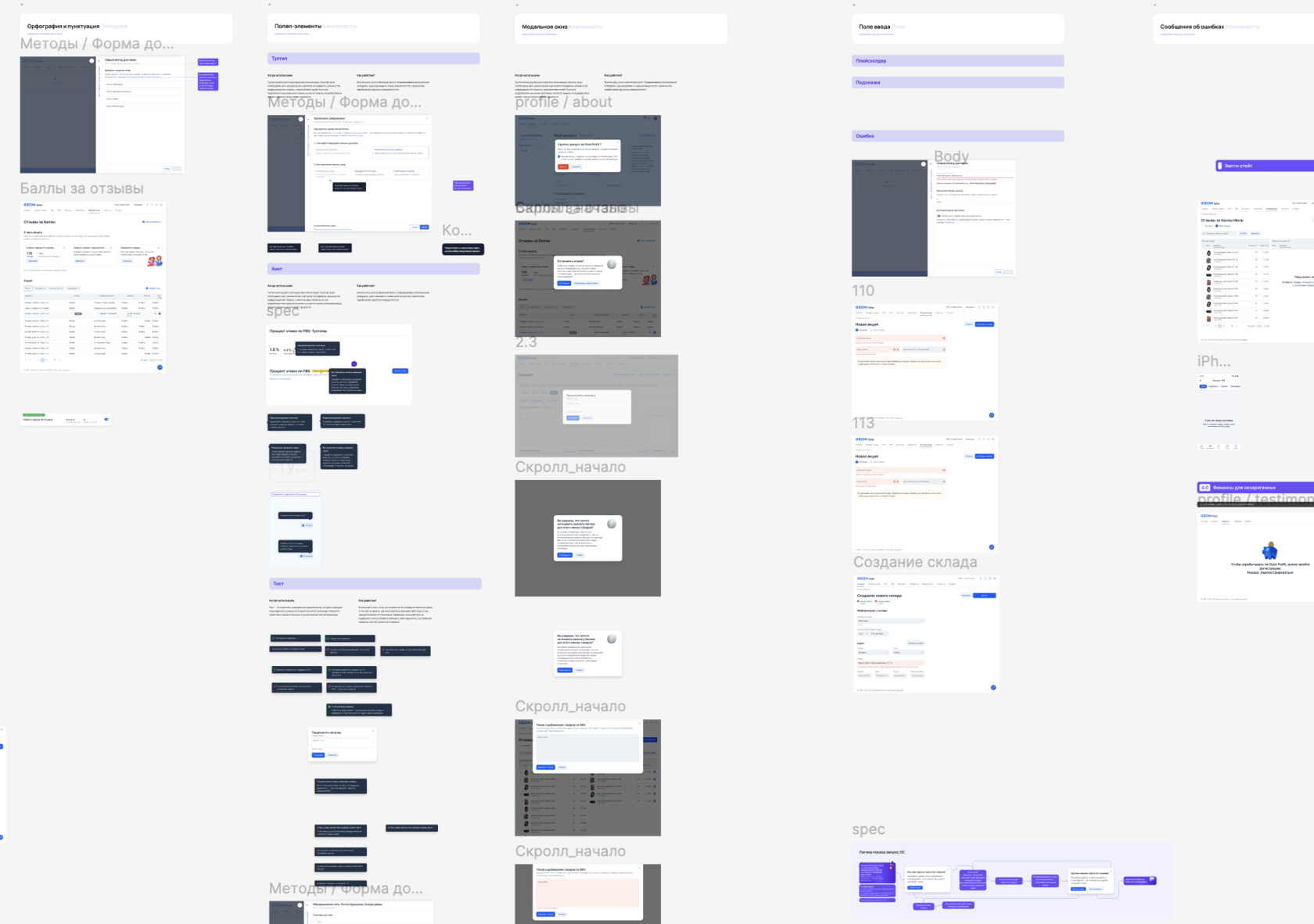
We created a shared Figma board and gave the team a month to collect real UI examples — the patterns they found clear, consistent, and effective in both design and copy.
2
Curate what’s already good
We met as a cross-functional group, writers and designers together, and reviewed these examples. We asked:
We met as a cross-functional group, writers and designers together, and reviewed these examples. We asked:
- Which ones do we already reuse again and again?
- Which ones are logically clear, user-centered, and consistent with our tone?
- Which ones make interface structure more obvious, not more confusing?

Every week, we reviewed one set of components — discussing real examples, debating their clarity, and locking in what deserved to become our shared standard both for designers and UX-writers.
3
Create the first guide — collaboratively
We compiled the best examples into a living document, our first content system draft. It included:
We compiled the best examples into a living document, our first content system draft. It included:
- Reusable blocks for onboarding and modals.
- Templates for error messages, labels, and confirmations.
- Naming principles for features and statuses.
- UX writing principles grounded in interface logic, not abstract brand tone.
We compiled our strongest patterns into a shared, living document — pairing reusable text blocks with matching visual components to form the first version of our content system.
4
Sync with the design system
Once the initial guide was ready, we began a series of structured workshops:
Once the initial guide was ready, we began a series of structured workshops:
- Designers brought interface patterns they wanted to standardize.
- Writers proposed text patterns that could be integrated by default.
- Together, we aligned on combined components, visual and verbal, and embedded them directly into our design system.
Importantly, this work didn’t stop after the first version
We’ve built an ongoing cadence, every week we meet to review proposed updates and discuss new cases. Throughout the week, team members collect examples, questions, or inconsistencies in a dedicated chat, making it easy to spot patterns and raise discussion topics organically.
This lightweight, continuous loop keeps the system evolving alongside the product without slowing anyone down. It’s become one of our most efficient feedback rituals.
This lightweight, continuous loop keeps the system evolving alongside the product without slowing anyone down. It’s become one of our most efficient feedback rituals.
Rolling it out: versioned guidelines + active governance
We introduced a versioning system for our editorial policy.
- Every update to the guide is documented and dated.
- New releases are announced to the entire design department.
- We keep a changelog so teams can understand what changed and why.
Impact: faster delivery, fewer rewrites, stronger UX
Here’s what changed across the product org:
- Designers stopped inserting placeholder text. They used real content patterns from the start.
- Writers spent less time on repetitive flows and more time on edge cases and strategy.
- Review cycles became shorter. There was less back-and-forth on “what’s the right tone?”
- Interfaces became more cohesive across teams and surfaces—with far less content debt.
Takeaways for UX leads
- Standardization should reflect reality. Don’t start with abstract rules, start with actual product examples.
- Cross-functional authorship builds adoption. If you want designers to follow content guidelines, invite them to help write them.
- Embed patterns where the work happens. Don’t just document components, integrate them into the design system and workflows.
Final thought: codify what works, evolve what doesn’t
Standardization isn’t about control—it’s about coordination. When teams don’t have to reinvent every button, every message, every naming convention, they move faster and make better decisions.
By building our content system on real examples, aligning with design, and rolling it out as a collaborative tool, we didn’t just clean up our UI.
We built a system our whole org could build on.